Responsive web app

Product goal
The Dutch Salvation Army needed a communication platform usable on desktop's. They were using a native mobile application for all internal communication, while their employees work mostly on desktops and often don't want company software on their mobile phones. A web-based application was needed to connect to the existing native app, so these employees can be connected to their teams on every device and browser.


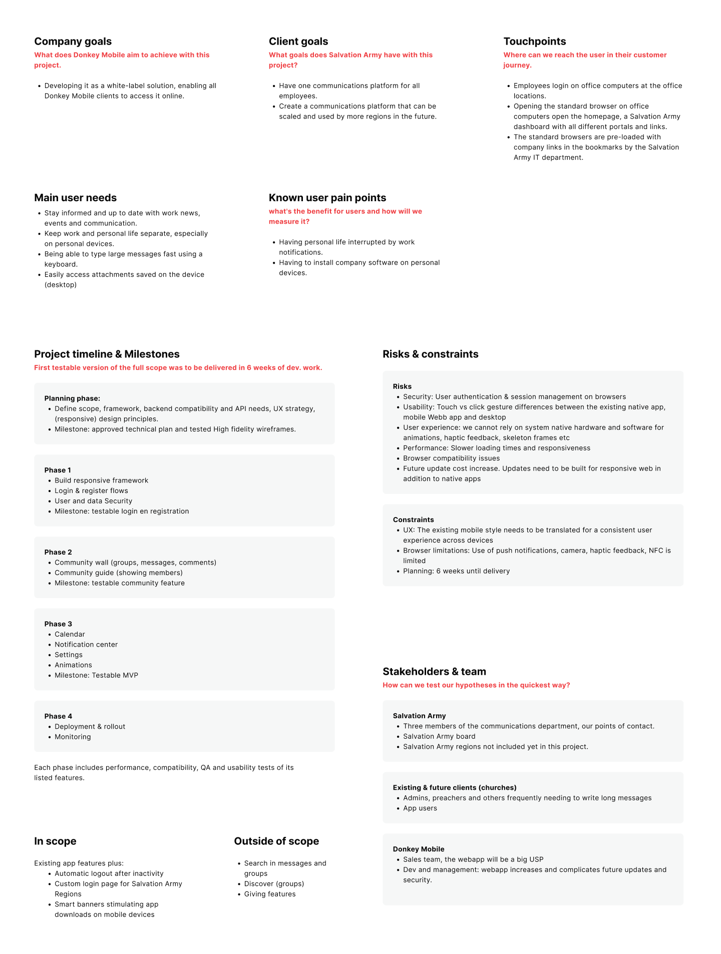
Project management canvas
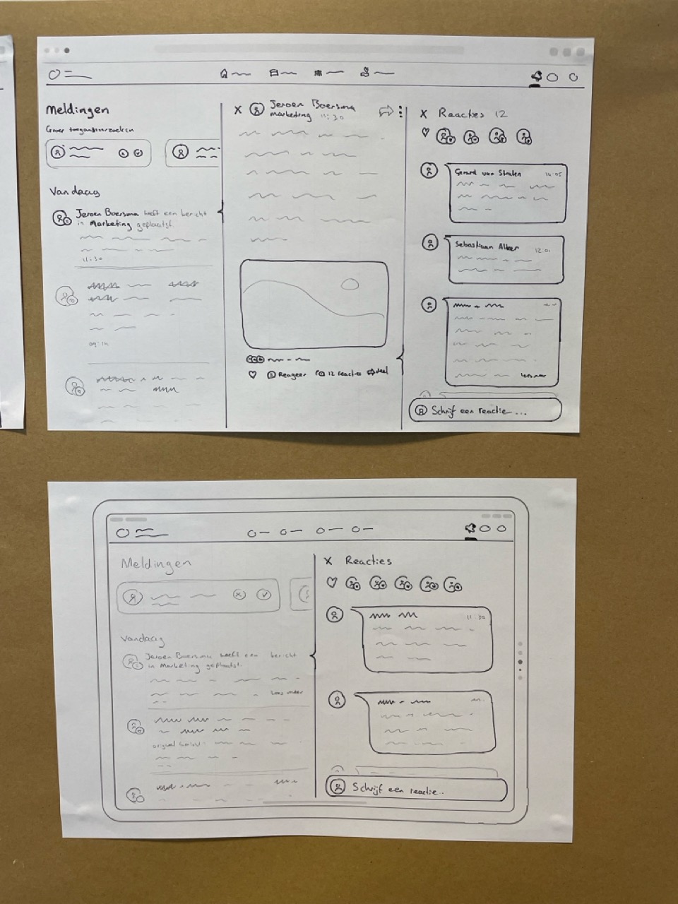
Brownpaper workshop & sketches
This workshop was conducted with our Salvation Army stakeholders.
Goal: Deliver the project planning milestones to the client while testing the customer journey, defined scope, and user pain points (later included in the canvas above).
Key Findings:
- A dedicated space on the Salvation Army portal homepage is needed to link to the login page.
- A "Remember Me" button should be added to the login page.
- The native mobile app offers a better experience than the mobile browser, so a smart banner prompting users to download the app can be beneficial.
- Minor UI and scope adjustments are needed.


Responsive grid
Foreseeing the complexity of our design—with group navigation, a post wall, and a menu—we decided to support multiple breakpoints to ensure a clean and functional UI across all devices.

Atomic design system
For the design system I created a new system for the web version of the app. Where typography, size and the scalibility of items can be different from the mobile version. The icon set and color styles were able to stay the same and connect to both the mobile and web design systems. For both systems we used the atomic design system for ease of use
Color and text styles


Atoms
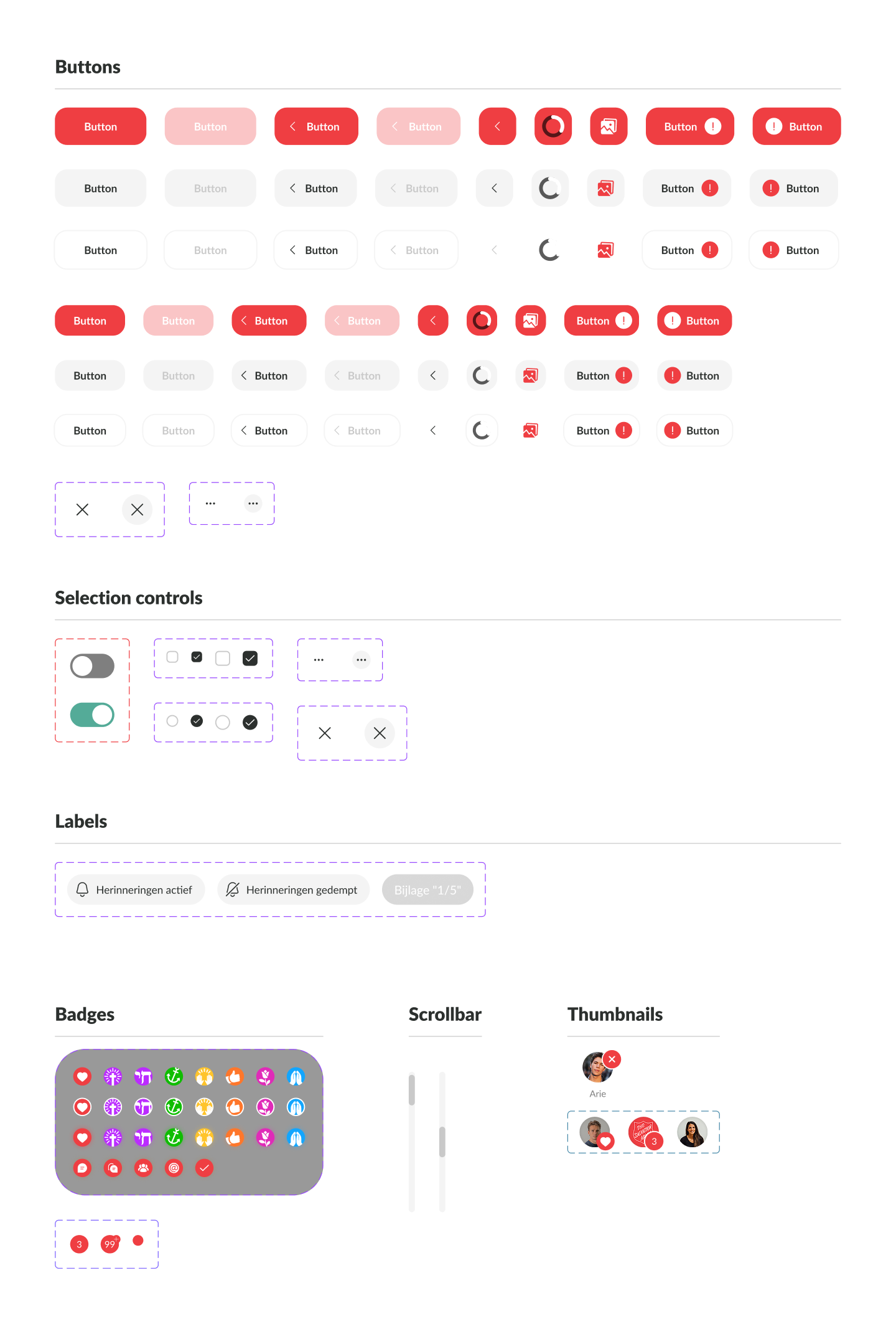
Molecules


Organisms


Responsive navigation
While many UI elements could be carried over into the new design system with minimal changes, the navigation patterns on desktop and tablet required a complete revision to fully leverage the additional screen space and accommodate device-specific UX conventions.
Challenges:
- Maintain user context while navigating deeper into app menus and content hierarchies.
- On larger screens: Preserve user focus on their current story while enabling seamless navigation back and forth between content types (posts, comments, events, users, etc.).

UI design


Key learnings
Creating a unified design system for web, tablet, and mobile devices was an absolute delight. The combination of the time pressure to complete the entire project in six weeks, the Salvation Army as a client, and the team’s true agile approach made this a highly fulfilling experience — especially because the client was eager to introduce the new platform across their organization.
During this project, I had the opportunity to deepen my expertise in:
- Responsive grid layouts
- Design systems
- Web accessibility
Most importantly, I learned to balance project planning and client communication (and collaboration) with agile teamwork alongside our development team — enabling us to deliver a large-scale project in record time.


